University research data looks like something from outer space – let’s zoom in and see what’s there
Research institutions need the right tools to discover their strengths and weaknesses, to plan for the future, and to make a greater impact for the communities of tomorrow. In this post, Digital Science’s VP Research Futures, Simon Porter, uses a digital telescope to view the ‘galaxies’ of research within our best and brightest institutions – and explains why that matters.
When we see new images of our universe through the lens of the James Webb Space Telescope (JWST), we’re left in awe of the unique perspective we’ve witnessed, and something about our own universe – even the perception of our own existence – has altered as a result.
What we see are entirely new galaxies, and worlds of possibility.
That’s also what I see when I look at the research data spanning our many universities and research institutions globally. Each one of these institutions represents its own unique universe of research within them.
For me, Dimensions – the world’s largest linked research database and data infrastructure provider – is like the JWST of research data. It enables us to see data in ways we hadn’t thought possible, and it opens up new worlds of possibility, especially for research strategy and decision-making.
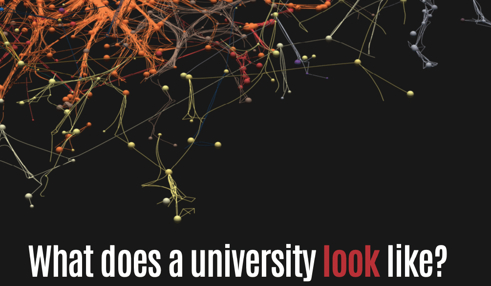
What does a university look like?
We began our What does a University Look Like? project in 2019 and it’s rapidly evolved thanks to developments in 3D visualization technology, the expansion of data availability, and the combination of data sources, such as Dimensions and Google BigQuery.
By modelling data from Dimensions into a 3D visualization tool called Blender, we’ve been able to see right into the detail of university research data and capture it in a way that is analogous to the process of taking raw data from JWST and processing it to make a high-quality snapshot of space from afar.
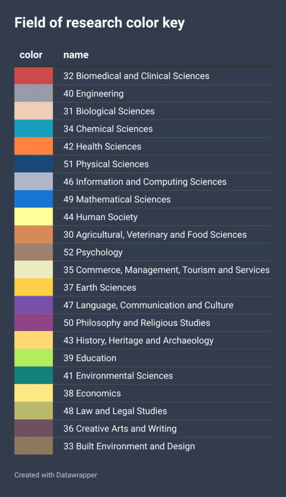
To do this, we’ve used the 2020 Field of Research (FoR) codes, which were developed for research classification in Australia and New Zealand, and we’ve designated a color to each one of those codes (see Figure 2). Each single point of color represents an individual researcher coded by the 2-digit FoR they’re most associated with; researchers are depicted by a sphere, and the size of the sphere is based on the number of publications that researcher has produced.
We then apply algorithms developed by CWTS at Leiden University to determine research clusters – co-authorship networks – within a specific university. These clusters are then layered on top of each other by discipline, with Clinical Science clusters at the bottom, then moving up through Health Sciences, then Science and Engineering, and Linguistics at the top. This is the result.
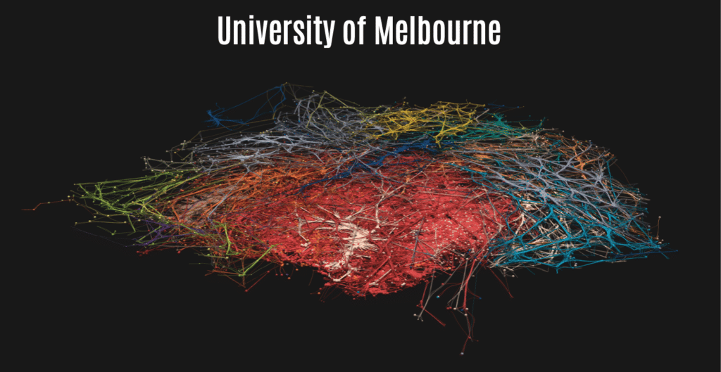
In Figure 1, we see a 3D visualization of the University of Melbourne, a leading Group of Eight (Go8) research university in Australia. Within this image are 234 research clusters, comprising connections between more than 18,000 co-authored researchers affiliated to the University of Melbourne from 2017-2022.
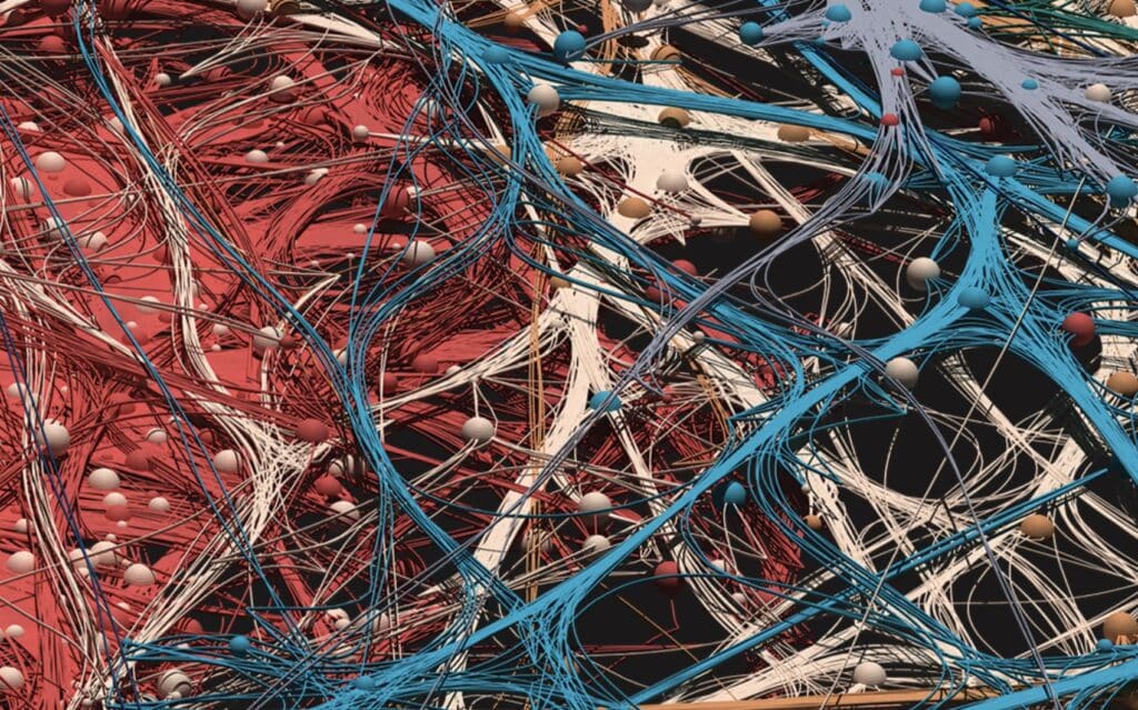
The high-quality nature of this visualization means we can zoom right into the level of the individual sphere (ie, researcher), or pull back to see the bigger picture of the research environment they’re connected to or surrounded by. We can see every research field and every individual or team they’re collaborating with at the university.
If the university has a biological sciences cluster, we can see whether there’s a mathematician interacting with that cluster, clinical scientists, engineers, or someone from the humanities or social sciences. It opens up a new level of understanding about the research landscape of an institution and its individuals.
On our Figshare, you can also watch a video that takes you through the various research clusters found at the University of Melbourne. You can also follow the “What does a university look like?” Figshare project here.
At Digital Science, we’ve created six of these visualizations – five universities from Australia and one from New Zealand – to help demonstrate Dimensions’ unparalleled capabilities to assist with analyzing research data. While many institutions have similarities, some are completely different in research collaboration structures (see Figure 4).
To see a brief video where I walk through all six of the visualizations, visit the Digital Science YouTube.
Looks great – but why does it matter?
These 3D visualizations aren’t just about producing a pretty picture; they’re an elegant and useful way of representing the richness of research data contained about each institution in Dimensions. This is particularly true for university administrations where the ability to measure and promote internal institutional collaboration is just as important as measuring international collaboration.
To illustrate this point, consider the differences between the collaboration structures of the Australian National University (see Figure 4) and the University of Melbourne. Beyond the immediate difference of network size and discipline focus (the University of Melbourne is larger, and has a much larger medical and health sciences footprint), the two universities have very different collaboration shapes, with disciplines more distinctly separate in the ANU graph. That two prestigious research institutions can have such different shapes suggest there are different external forces at play that influence the shape of collaboration.
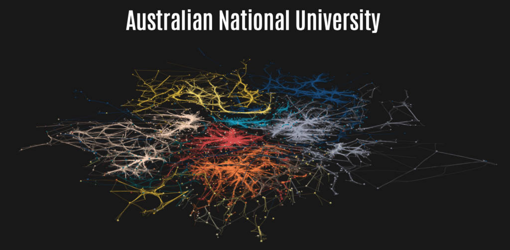
Figure 4 represents the Australian National University (ANU), with more than 5,600 co-authored researchers from 2017-2022 and 75 research clusters identified in the data.
Two reasons that might significantly contribute to the different shape of ANU are its funding model and physical campus shape. ANU’s funding model is unique within Australian higher education, having been endowed with the National Institutes Grant, providing secure and reliable funding for long-term pure and applied research. A key focus of the grant is maintaining and enhancing distinctive concentrations of excellence in research and education, particularly in areas of national importance to Australia. This concentration of excellence is also perhaps reflected in the relative discipline concentration within the visualisation. ANU is also a relatively spread out campus at roughly three times the size of the University of Melbourne’s Parkville campus, making the physical collaboration distance between disciplines larger.
By beginning to identify how factors such as size of campus and funding models can influence the collaboration structures provides key insights for universities, governments and funders. The relative ease of creating these models based on Dimensions data opens the possibility of creating collaboration benchmarks able to be correlated with other external factors. These insights can in turn help shape interventions that maximise local collaboration, in line with the culture of the institution. As with stargazing, the more you look into the past, the better you can see the future.
Note: Simon Porter first shared these visualizations at the Digital Science Showcase in Melbourne, Australia (28 February to 2 March 2023).

About Dimensions
Part of Digital Science, Dimensions is the largest linked research database and data infrastructure provider, re-imagining research discovery with access to grants, publications, clinical trials, patents and policy documents all in one place. www.dimensions.ai
About the Author

Simon Porter, VP Research Futures | Digital Science
Simon Porter has forged a career transforming university practices in how data about research is used, both from administrative and eResearch perspectives. As well as making key contributions to research information visualization, he is well known for his advocacy of Research Profiling Systems and their capability to create new opportunities for researchers.
The post Discovering ‘galaxies’ of research within universities appeared first on Digital Science.
from Digital Science https://ift.tt/sJEt1jl
.png)


No comments:
Post a Comment